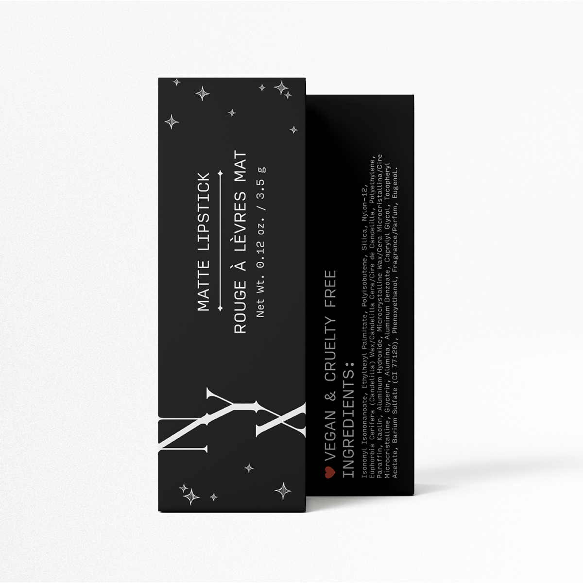
IDENTITY // PACKAGING DESIGN
A reimagined packaging design for NYX Cosmetics! I chose NYX for this identity systems project not only because I wanted to visually make them stand out from their competitors, but also make their cruelty-free promise more apparent.
NYX Cosmetics uses products from renewable resources and sustainable manufacturing practices and I wanted a new look to reflect that while also emphasizing the meaning behind the name (the brand is named after Nyx, the Greek goddess of the night). Making the ingredients more visible and safe is always great. It is good to know what is in your makeup and what goes on your face.
WORDMARK & TYPEFACES

COLOR PALETTE

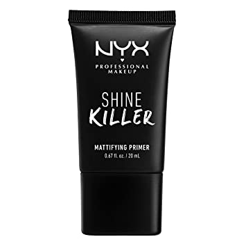
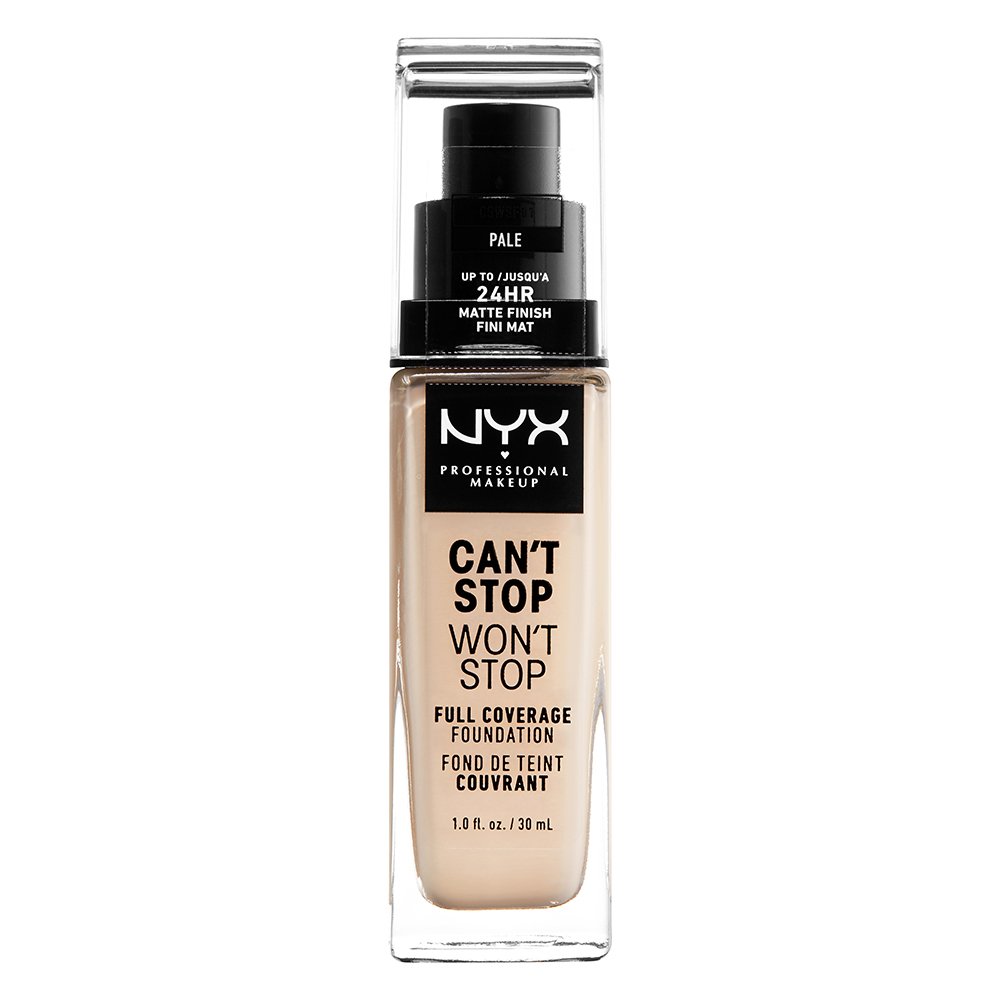
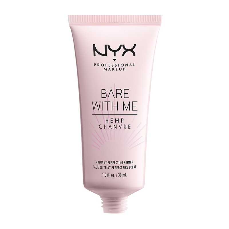
CURRENT NYX PRODUCTS
Reasons why I chose to rebrand NYX’s current packaging:
︎ lack of typographic hierarchy
︎ too wordy
︎ ingredients are obscure

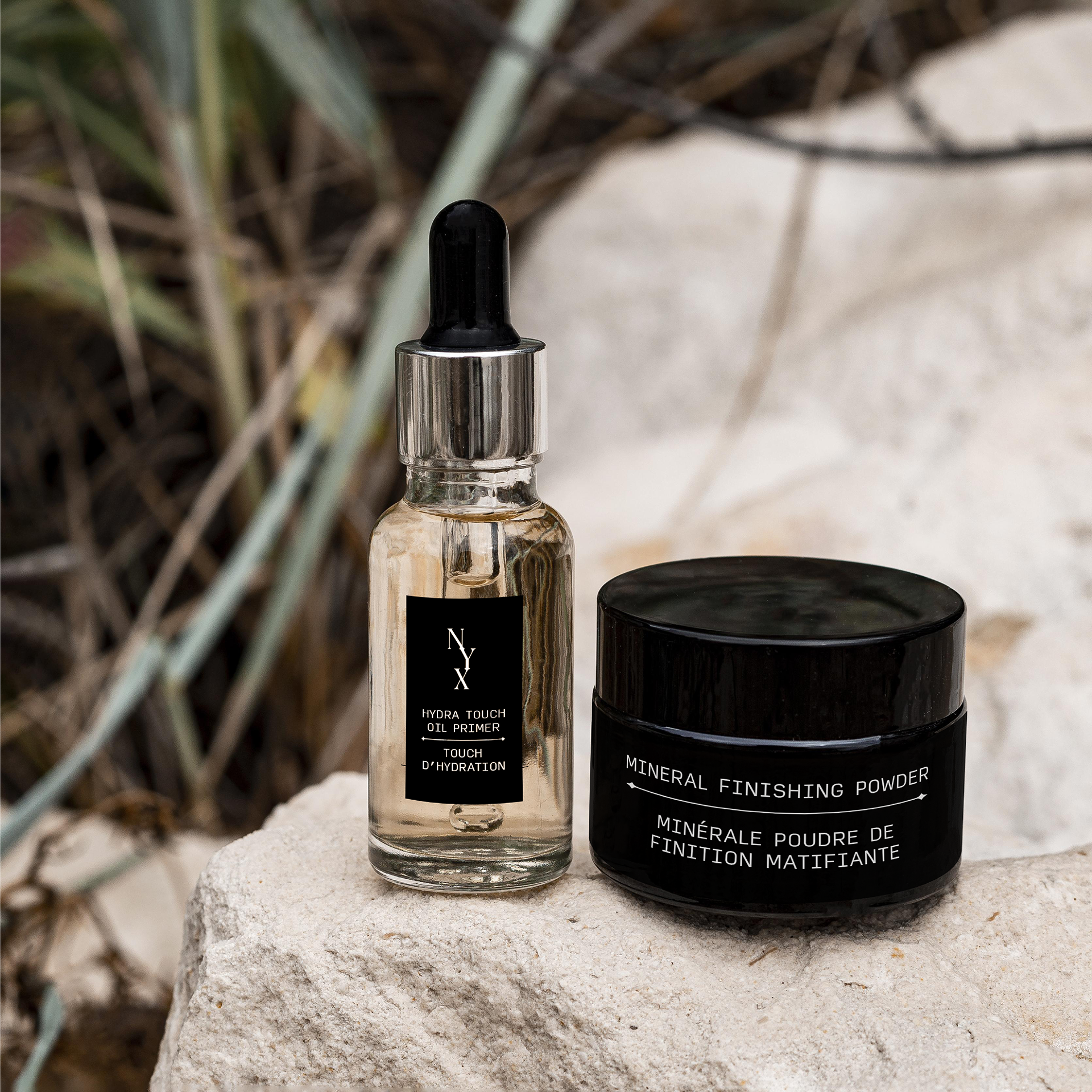
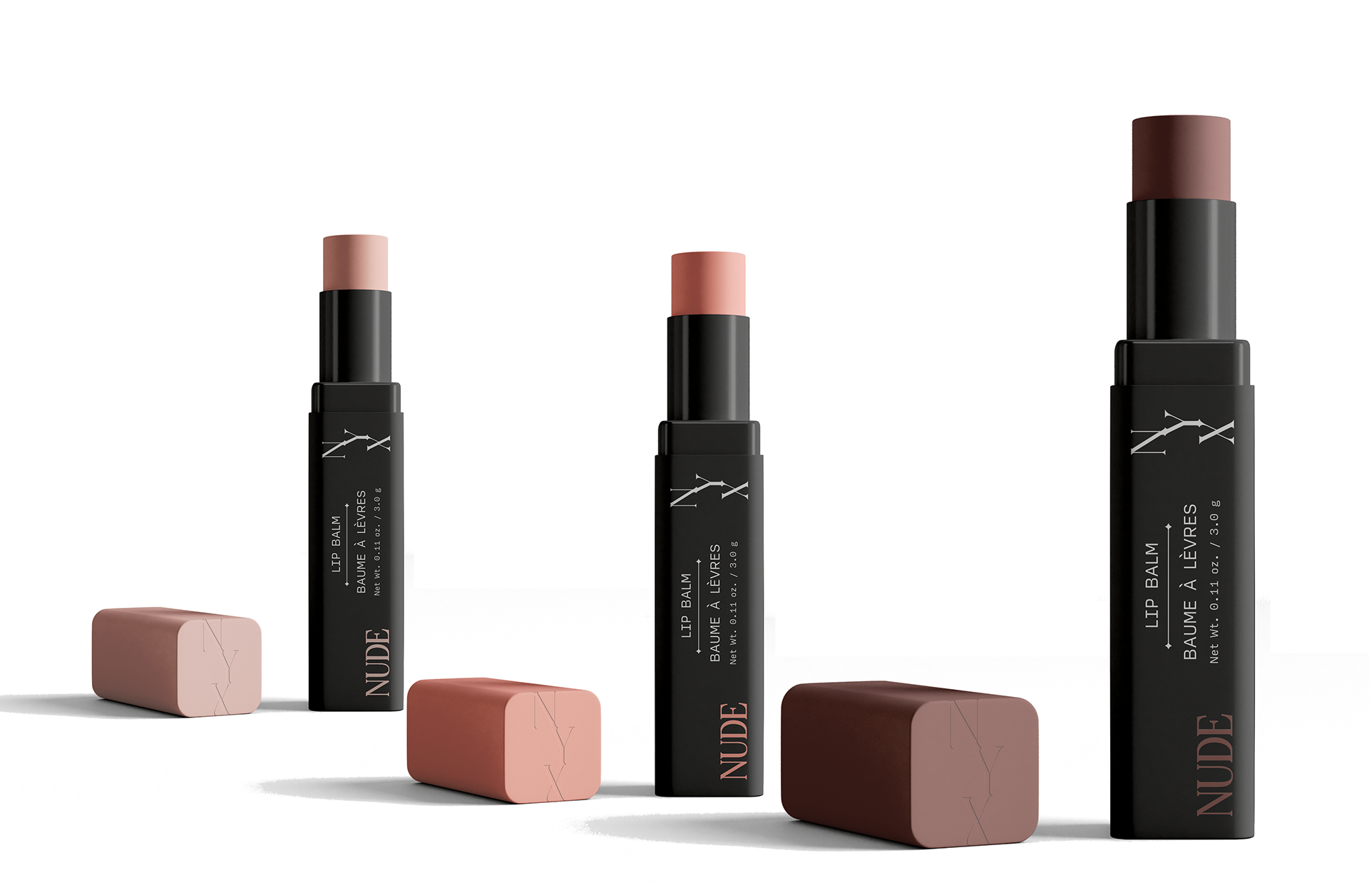
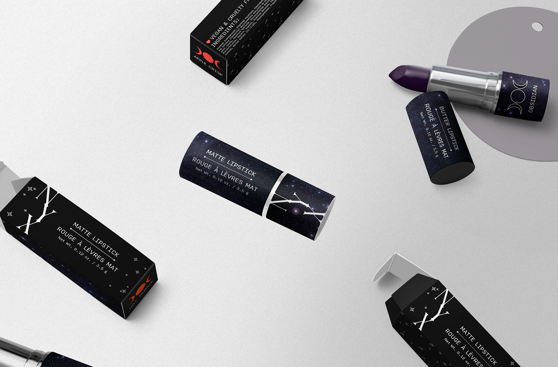
REIMAGINED NYX PRODUCTS
︎ oil primer
︎ mineral finishing powder
︎ lip balm
︎ waterproof mascara
︎ lipstick
︎ mineral finishing powder
︎ lip balm
︎ waterproof mascara
︎ lipstick

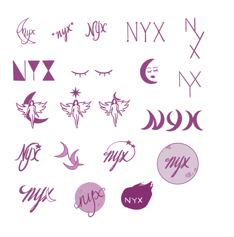
INITIAL DESIGN CONCEPT_01

MOOD BOARD + SKETCHES