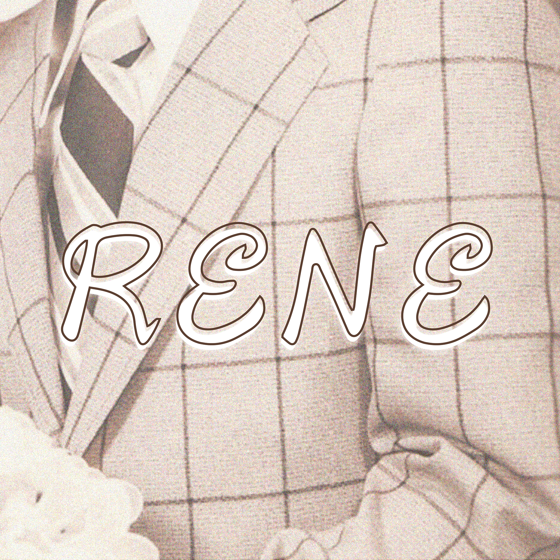
RENE: A MEMORABLE TYPEFACE
RENE: A MEMORABLE TYPEFACE
Rene is a typeface inspired by my late father's handwriting. I have always found his handwriting quite fascinating and this typographic project has allowed me to bring his writing in a digital setting. Additionally, this project is meaningful to me as it allowed me to preserve his handwriting beyond physical documents.

FULL TYPEFACE
For legibility purposes, I combined the heavier weight of my handwriting with the thinner quality of his. With this combination, I made sure to still keep the intricacies and unique characteristics from his original writing. I went though my notebooks and examples of his writing in documents like my signed report cards, recipes and a notebook to find ways to combine them. His notes have a combination of uppercase and lowercase letters. The E's are similar to a backwards 3 and the D,O,Q have swirls in the middle most likely due to the swift movement of the ink marks.

EXAMPLES OF MY FATHER’S WRITTING
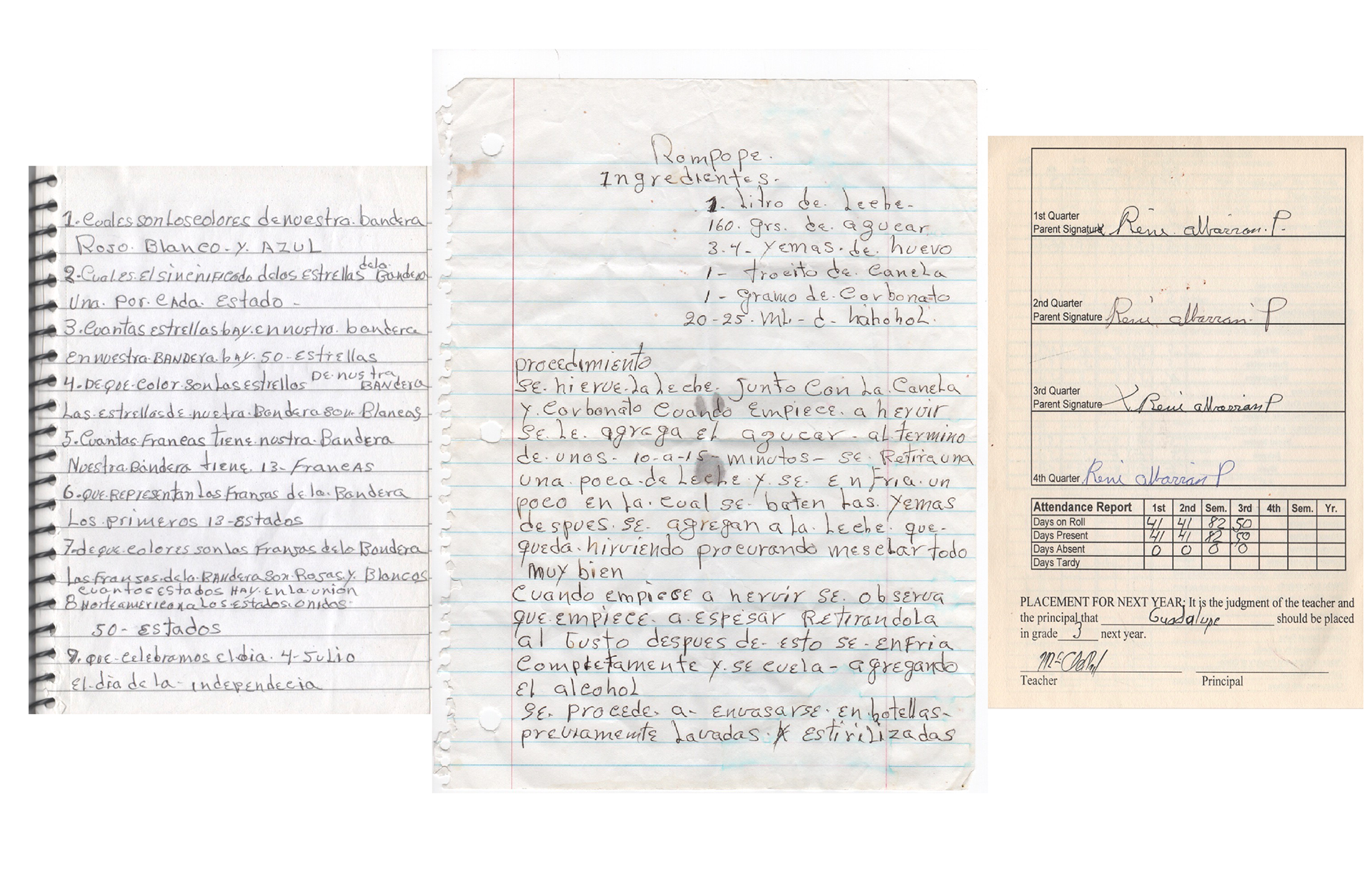
Left: 8 questions and answers to the American Citizenship test
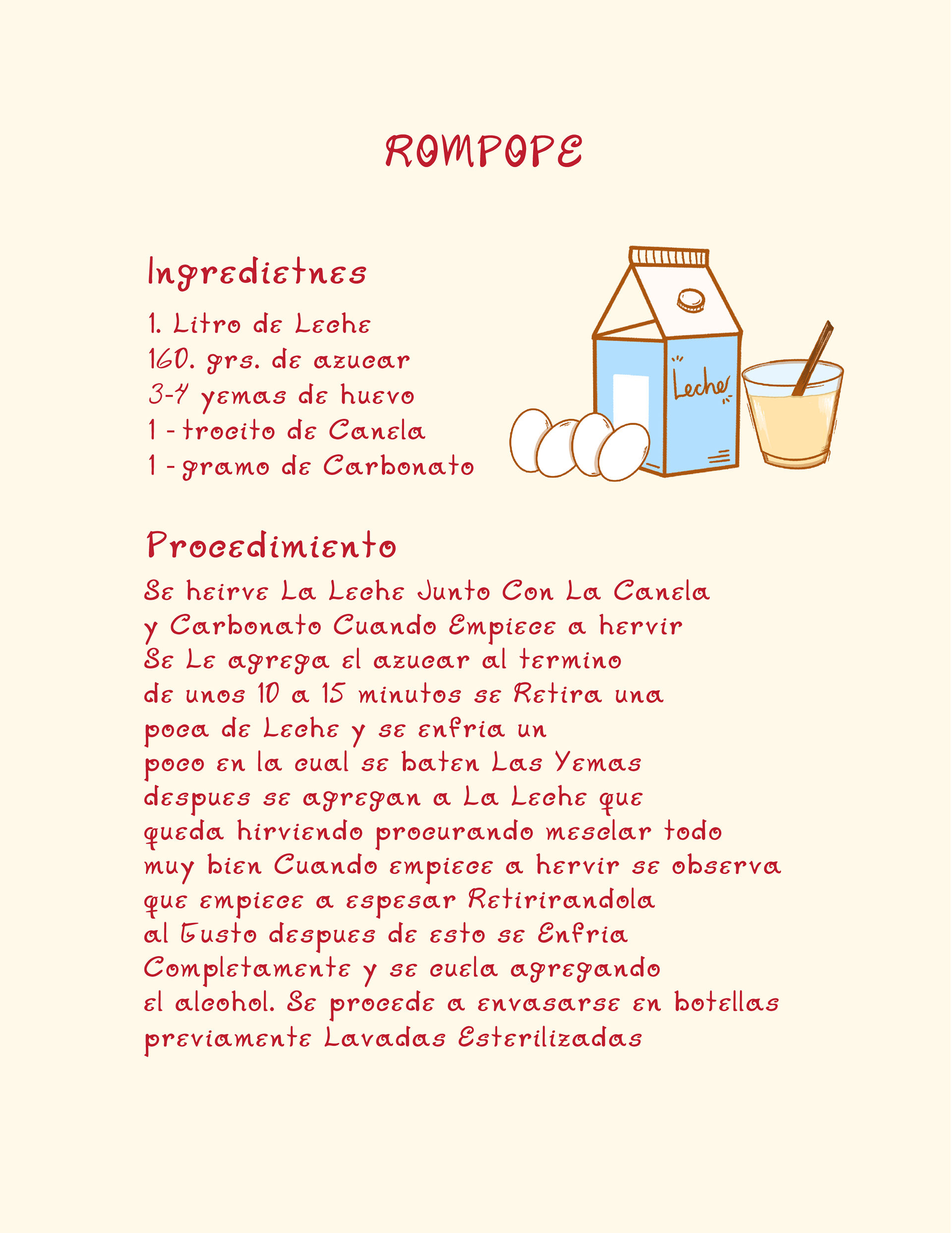
Middle: a recipe for delicious eggnog
Right: signatures on my 2nd grade report card. Look at that perfect attendance!![]()
Middle: a recipe for delicious eggnog
Right: signatures on my 2nd grade report card. Look at that perfect attendance!
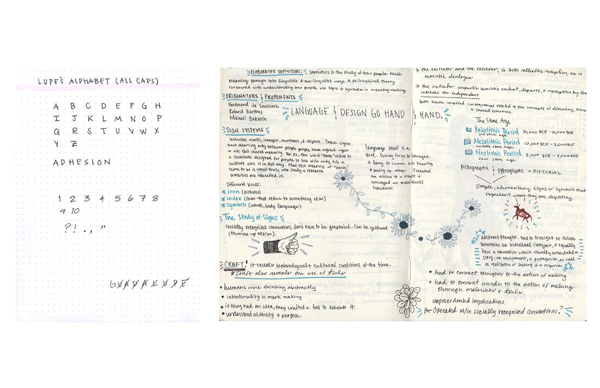
EXAMPLES OF MY WRITTING
Left: my typical alphabet in uppercase letters, numerical values and punctuation
Right: notes from my history of graphic design class 💻
Right: notes from my history of graphic design class 💻

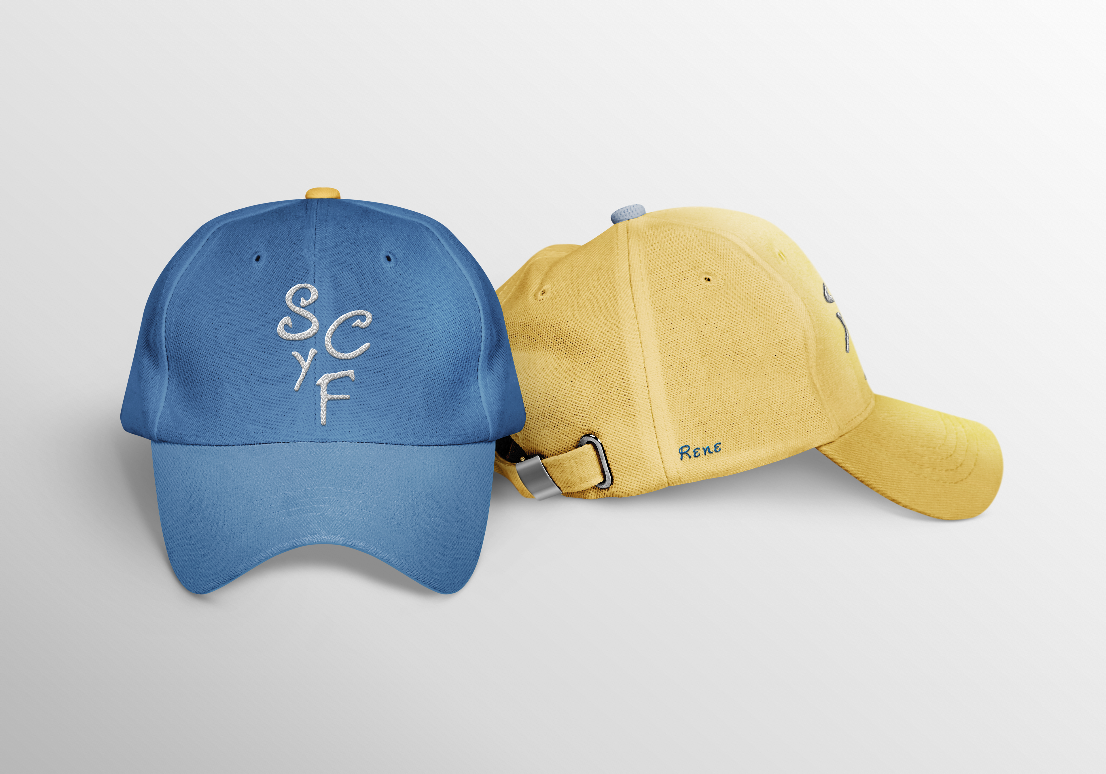
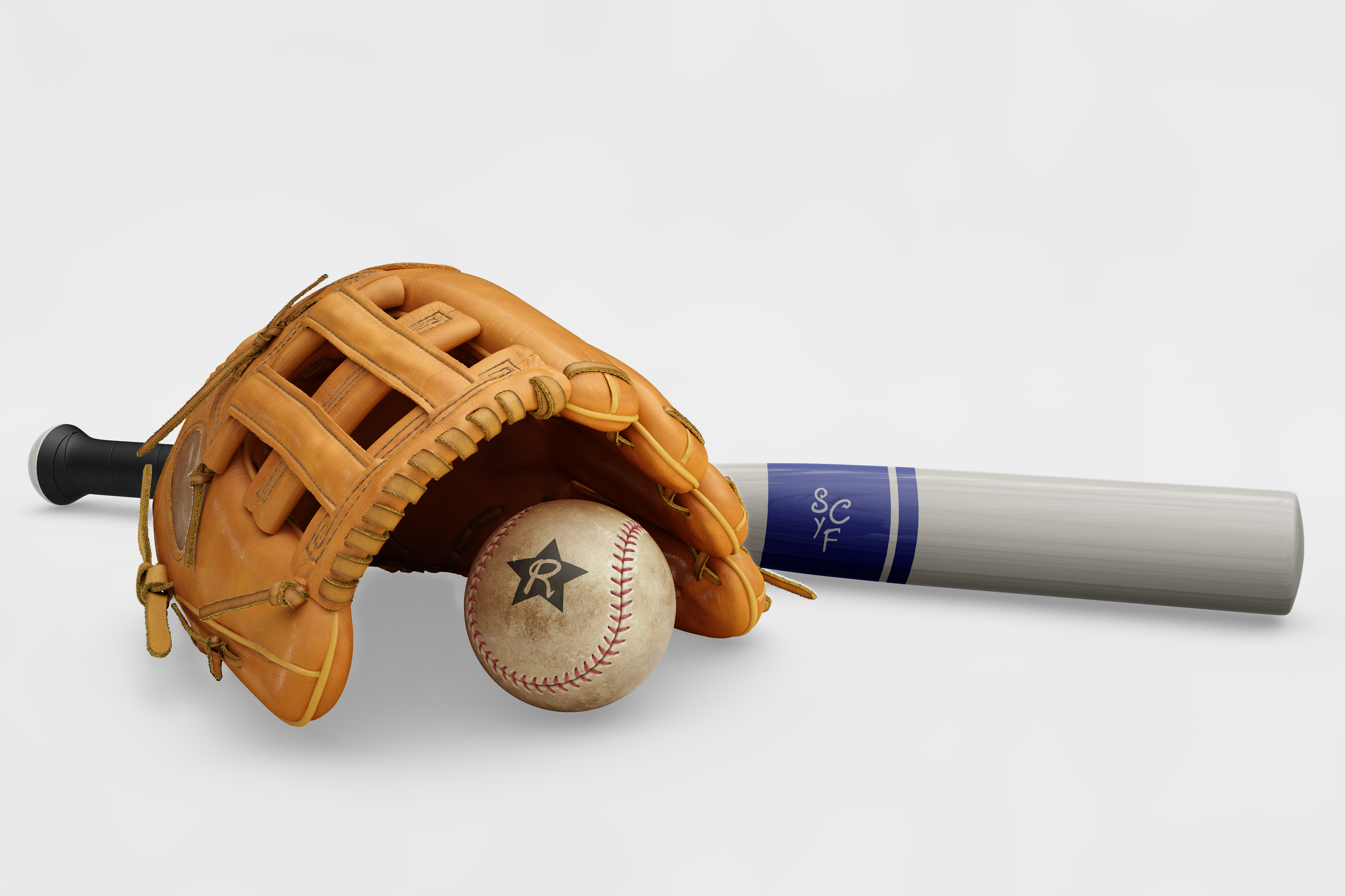
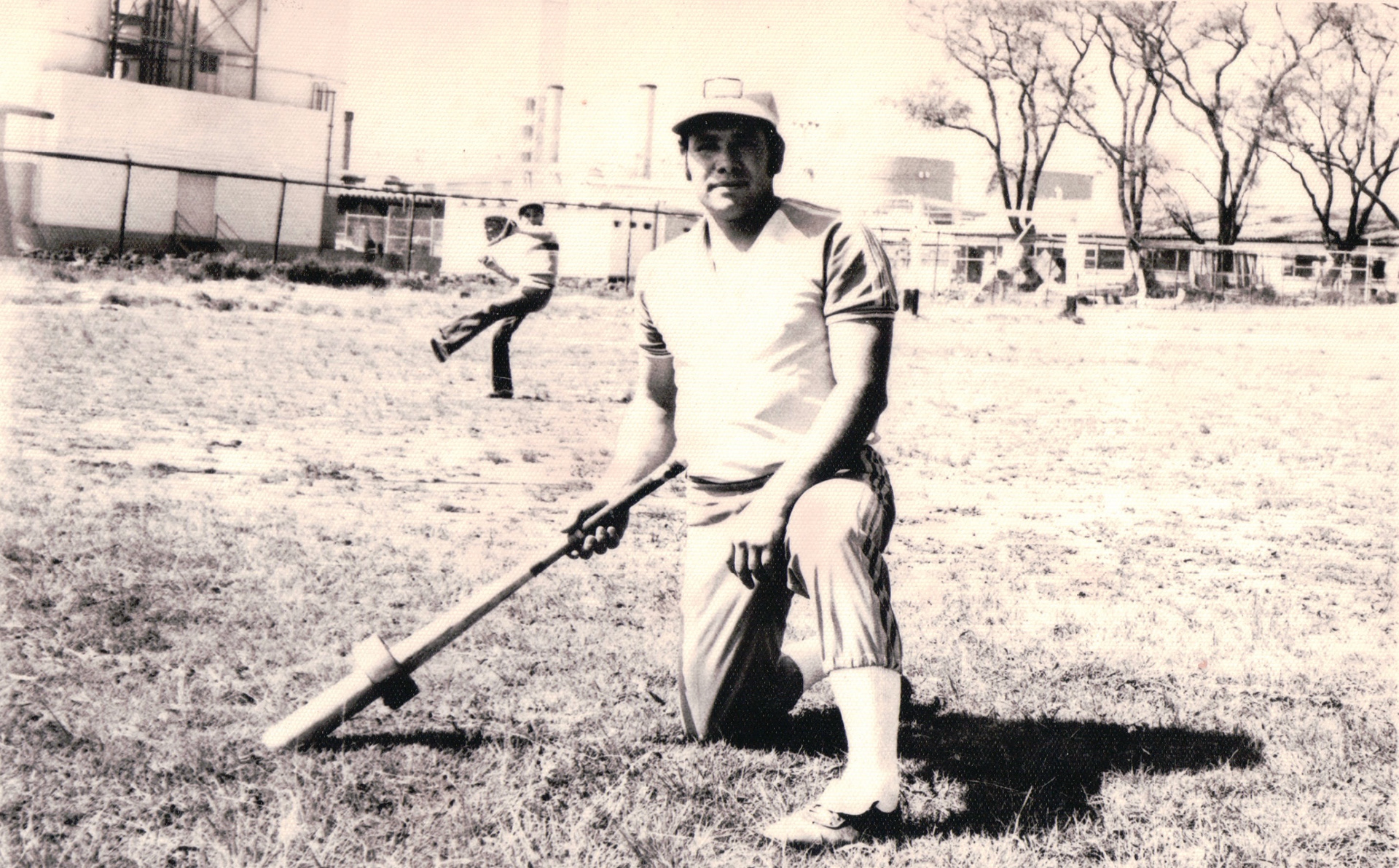
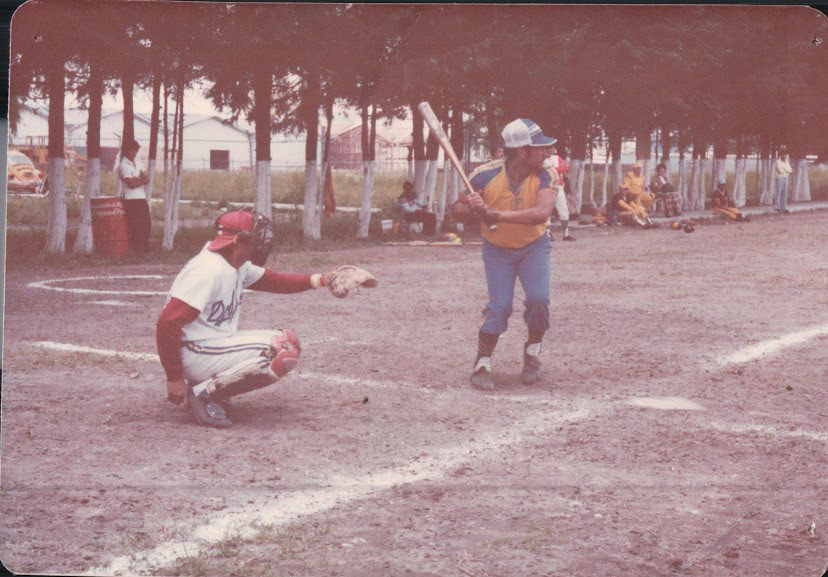
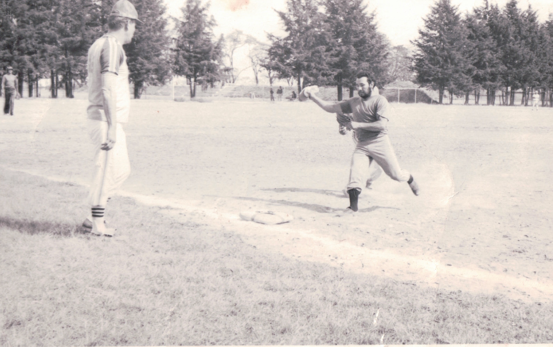
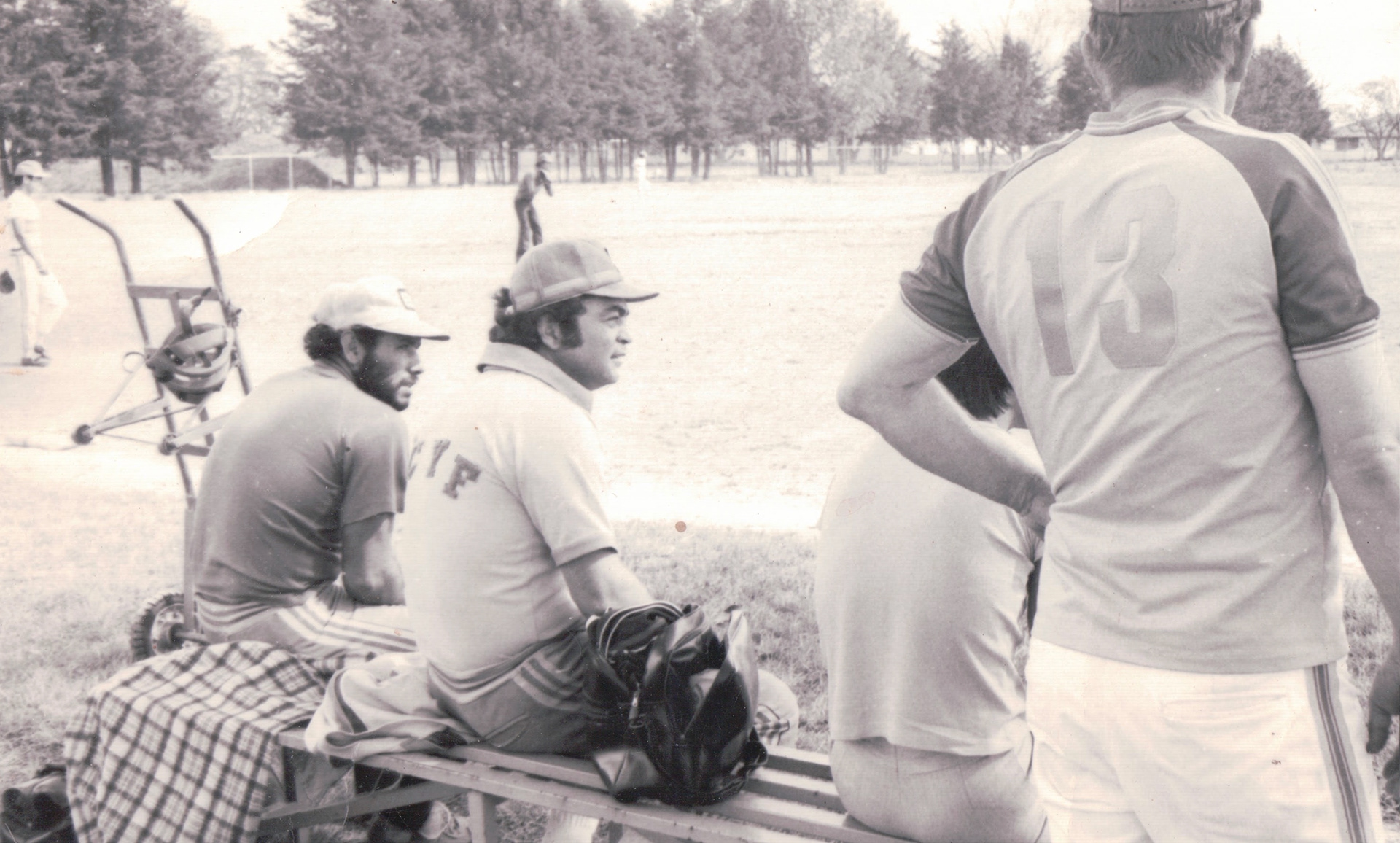
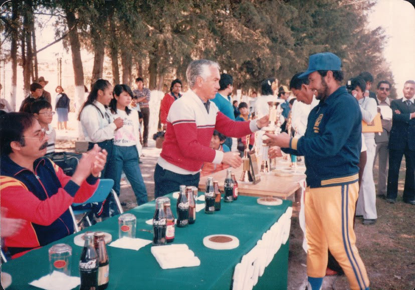
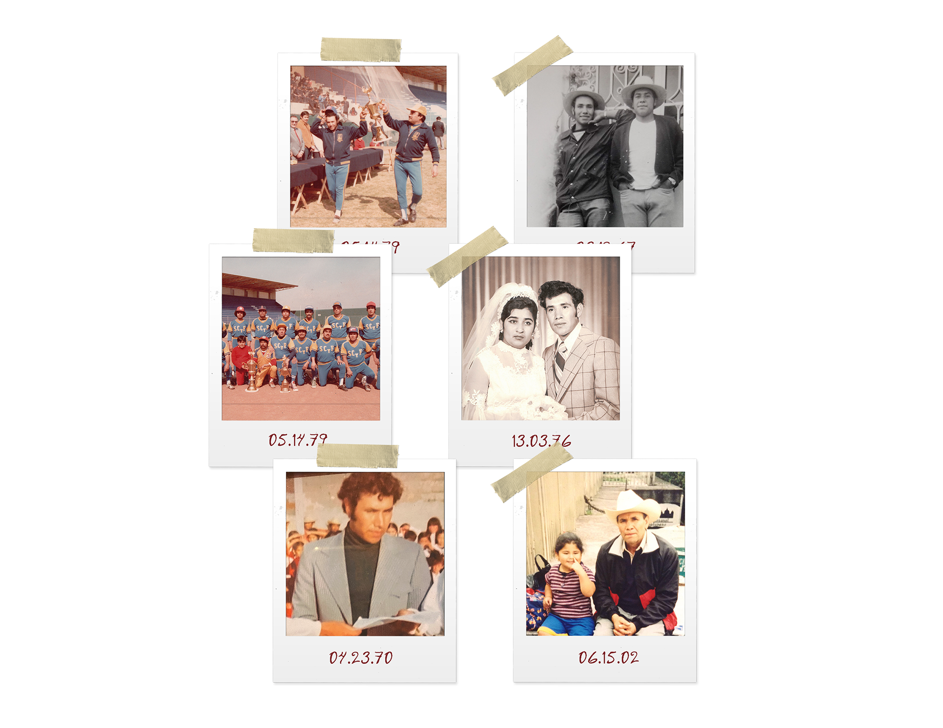
BEISBOL ⚾️ 🧢
In the late 70's, my father played baseball in Toluca, Mexico. The name of the team he frequently played for was La Sociedad Cuauhtémoc y Famosa, (SCYF for short).